Newsy
Creative Director
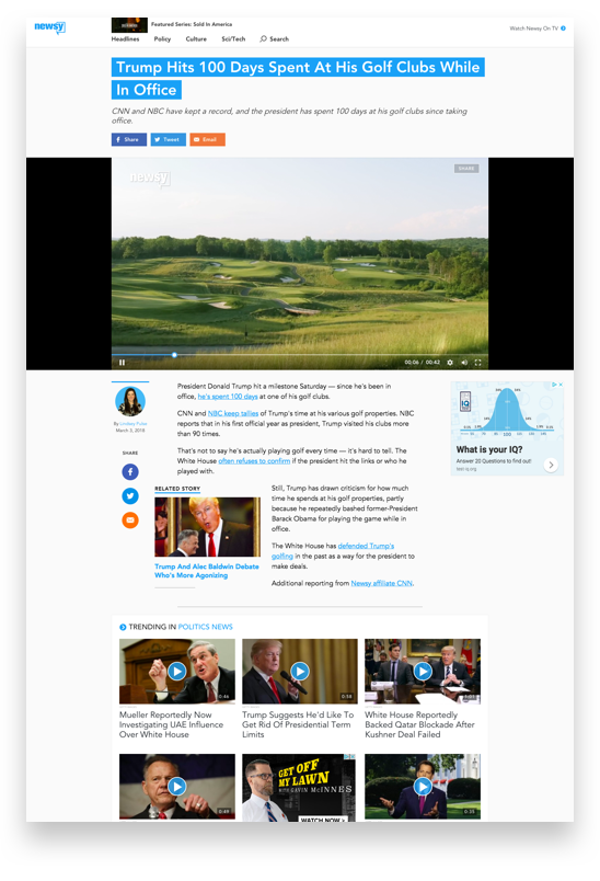
At Newsy I created brand standards, optimized the website to increase conversion, created visual standards across broadcast, web, and print, and guided motion standards for video graphics.

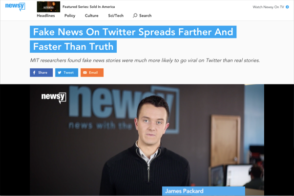
Focused above the fold
With news, impressions are everything. The headline, subhed, and sharing icons are given front billing. The video is allowed to peek generously from just below the fold to encourage scrolling down the page.

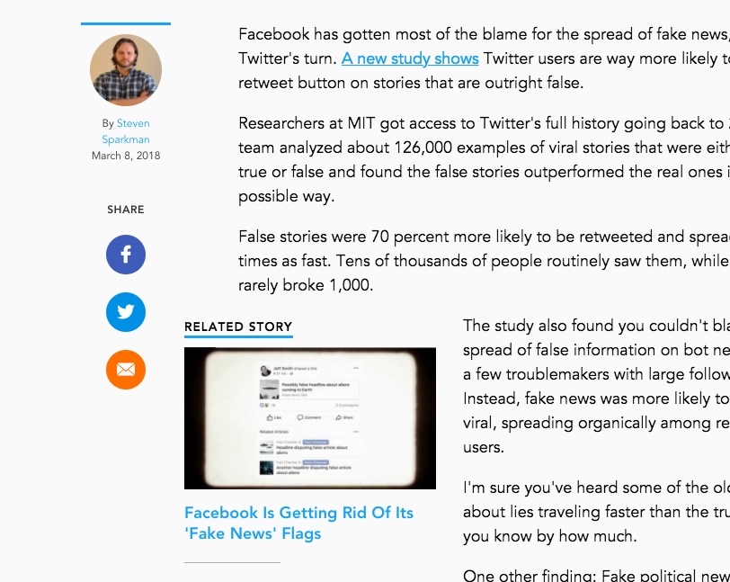
Typography: nailed
For written articles, readability is key. Type size and spacing were carefully chosen and validated in order to give readers the news in a quick, easy to read format.
Sticky sharing
Social was fundamental to how Newsy does business. Getting a story out to the audience happened primarily through social channels and sharing by email.
Always-present buttons give readers the option to quickly show others what they are reading.
Unique solutions
Newsy needed an interstitial animation that was always updating with new headlines. I partnered with the graphics team to build a single-purpose web page with smooth CSS animations and a custom API.
Problem solved.

